
How to create a console menu using CommonUI
In the following post, I will show you how to use UE5’s CommonUI plugin to build a User Interface. We will create a simple Pause Menu with settings that work on PC and console.
CommonUI provides navigation within the active widget and prevents leaving an active widget to another in the background. Also, it allows us to get stacks of widgets and move between them. It also gives the opportunity to create styles for buttons, texts, borders, and text scrolls. It is recommended to use it from the beginning of the project if it’s going to be released on modern consoles as it simplifies many aspects of the UI for consoles.
Setting up CommonUI is quite complex so don’t hesitate to check out our demo project:
https://github.com/TheSamurais/CommonUIProject
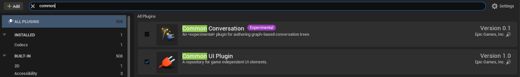
Plugin setup
First, we need to activate the CommonUI plugin in the editor:
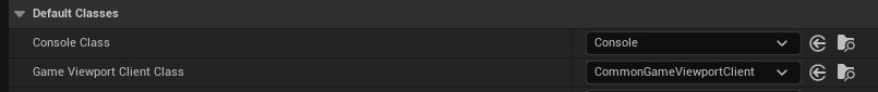
After that, we need to find the viewport class in Edit -> Project Settings -> Engine -> General Settings -> Game Viewport Client Class, set it to CommonGameViewportClient, and reset the Editor:
Input binding setup
This high-level dependency diagram of the Common Input Settings shows how bindings are connected:
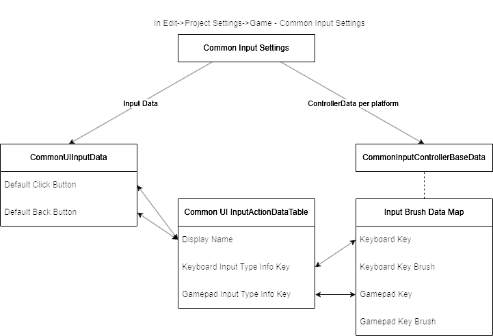
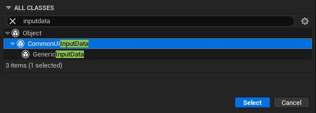
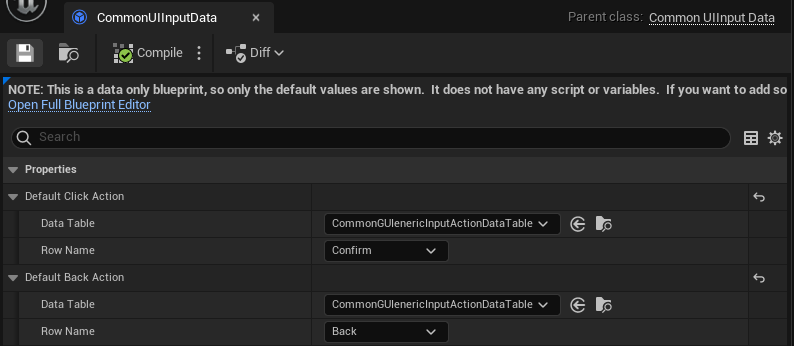
In Edit -> Project Settings -> Game -> Common Input Settings -> Input Data we create a blueprint of type CommonUIInputData with the name CommonUIInputData. Later we will go back here to set input settings for confirm and back actions in this blueprint:
For this blueprint, we need sets of inputs to use in our widgets so we need to create a CommonUIInputActionDataTable:
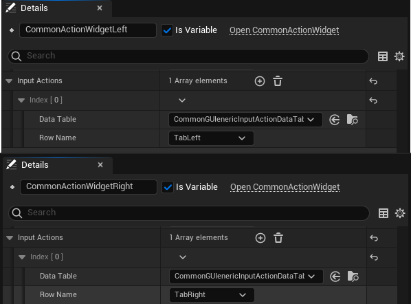
Inside this data table we will set up buttons: confirm, back, tab left, and tab right:
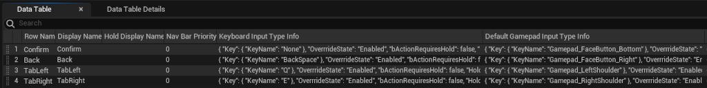
The “Confirm” action on the PC cannot be overridden in CommonUIInputActionDataTable and it is hardcoded to “Space” (tested in UE 5.2).
Now we can go back and set input settings for “Confirm” and “Back” actions in our previous blueprint CommonUIInputData:
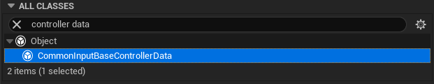
Now, to bind these input actions to the proper UI glyphs we need to add a ControllerData (Pic 8.), i.e. one for Mouse and Keyboard and another for XBox Gamepad. Then, we go back to Edit -> Project Settings -> Game -> Common Input Settings -> Platform Input and here we connect the ControllerData to our platforms (Pic 9).
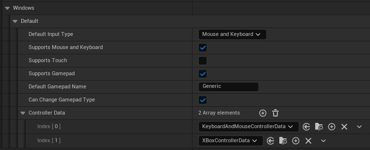
Remember to change the DefaultGamepadName to the same name that is used by ControllerData – by default it should be changed from “Windows” to “Generic”. If you compiled your Engine with consoles SDKs, you can choose different GamepadName in the ControllerData.
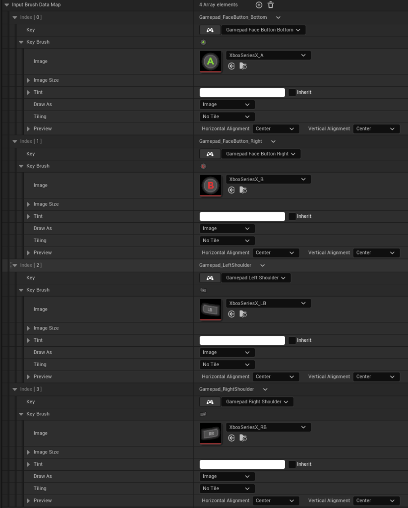
Then, inside the ControllerData, we bind gamepad buttons to their respective glyphs:
Creating UI
Before we begin forming our UI we need a couple of things:
- WBP_MenuButton of type
CommonButtonBase - WBP_TabButton of type
CommonButtonBase - WBP_ActionBarButton of type
CommonBoundActionButton.
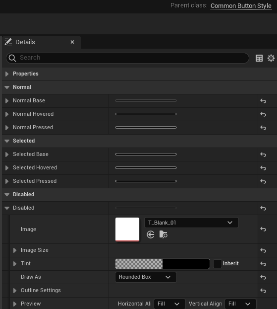
CommonUI allows us to change the style of any button (selected, hovered, pressed) through the CommonButtonStyle class. We can set the style in one place and then attach it to any descendant of CommonBaseButton. So for example we can create a style for menu buttons and another for settings buttons:
WBP_TabButton selection with gamepad/keyboard will use the “selected base” style by default (white color).
Styles can be chosen per button or we can assign CommonButtonStyle style to buttons. The latter will change all buttons that have this style attached.
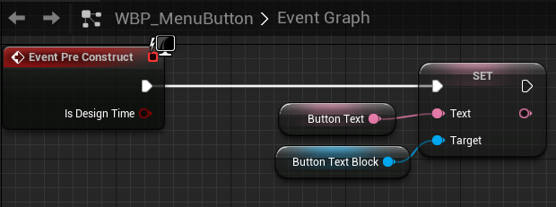
In WBP_MenuButton beside the usual text, we need to add a CommonActionWidget and name it exactly “InputActionWidget” so it is bound for visualization behavior:
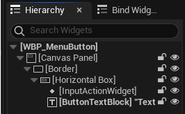
Inside the WBP_MenuButton graph, we add a new variable ButtonText that is Instance Editable and set it to the ButtonTextBlock:
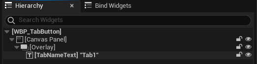
Similarly, we create WBP_TabButton. The only change here is we can choose different style for this button. Also, we don’t need to add InputActionWidget as its input icon will not be used here.
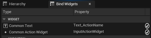
Next, in WBP_ActionBarButton we need a CommonText and InputActionWidget. Same as in WBP_MenuButton, components need to have specific names, otherwise they won’t work automatically with ActionBar. The CommonText needs to have the name “Text_ActionName” as in the menu Window -> BindWidgets (Pic. 16). You can see the checkmark next to the Property, so you know the widget is bound correctly.
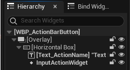
TextBlock named “Text_ActionName” is mandatory and the widget blueprint will not compile if it is missing.
When our inputs and button classes for UI are ready, we need to set up a base for our UI – a container widget. Let’s call it WBP_MainContainer and it would be of type CommonUserWidget. In there, we add CommonActivatableWidgetStack and CommonBoundActionBar:
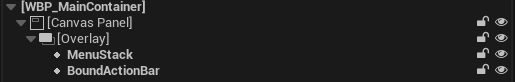
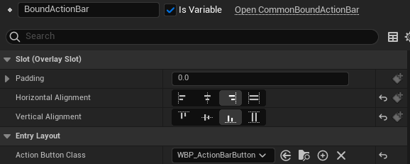
We will keep our widgets on a stack and show current action bindings on ActionBar. Now we need to add the widget into the view. Inside BoundActionBar we need to specify which button class we want to use for our control bar. I our case it’s WBP_ActionBarButton:
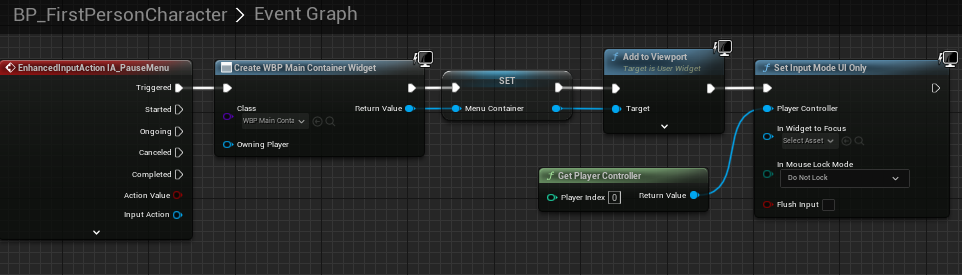
After that, we want to display this container on screen. For proper setup, we will add it in the player character with EnchancedInputAction IA_PauseMenu which supports keyboard and gamepad:
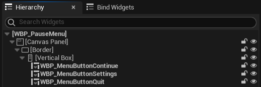
Now, we need to create our WBP_PauseMenu of type CommonActivatableWidget class. It will contain 3 buttons of class WBP_MenuButton: continue, settings, and quit game:
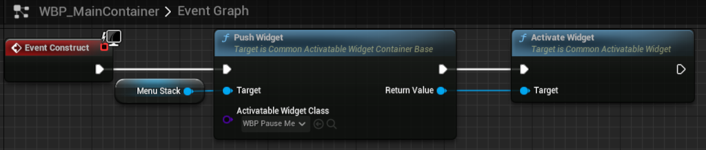
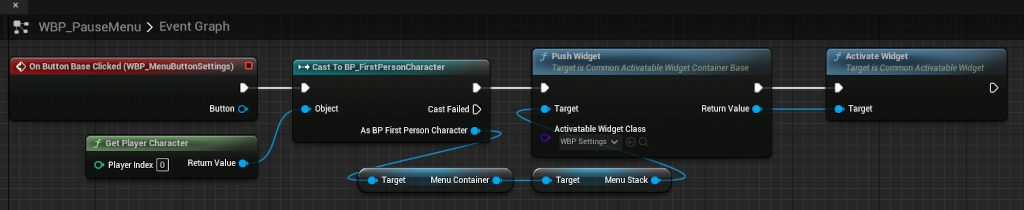
To show the WBP_PauseMenu we push it to the WBP_MainContainer. Also, we need to activate the widget if it is not set to auto-activate:
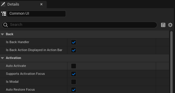
We also want to use back binding to close the menu. We need to go to the WBP_PauseMenu and set the Class Defaults as follows:
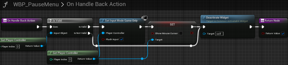
With that, we need to override OnHandleBackAction to properly handle exiting the pause menu and regain focus on the game:
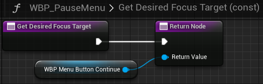
To gain focus on the activation, a GetDesiredFocustTarget() function needs to be overridden and return the button that we want to focus on:
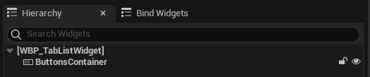
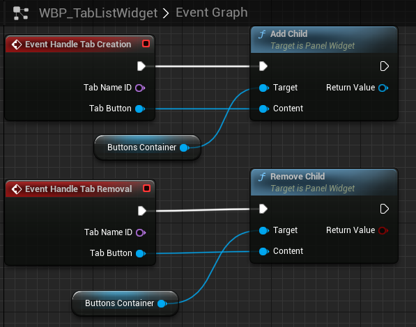
Now, let’s prepare a settings menu with few tabs. For adding tabs to UI, we create WBP_TabListWidget of the CommonTabListWidgetBase class. Inside, we add a horizontal box and bind two events: “Handle Tab Creation” and “Handle Tab Removal”. This allows us to add and remove CommonButtons in the UI.
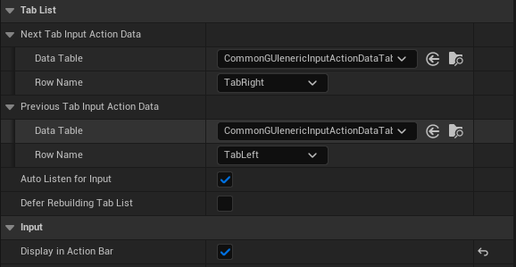
The important thing is to set “Next Tab Input Action Data” and “Previous Tab Input Action Data” in details of the WBP_TabListWidget. This way we will be able to navigate the tab list using bindings.
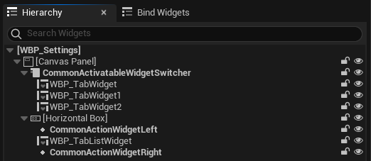
The next step would be to create a settings widget WBP_Settings of type CommonActivatableWidget. It contains:
CommonActivatableWidgetSwitcherwith 3 example WBP_TabWidgets of typeCommonActivatableWidget- 2x
CommonActionWidgetsdisplaying glyphs for tabs navigation - WBP_TabListWidget containing buttons for jumping between tabs:
In the details of the WBP_Settings, we set the same settings as in WBP_PauseMenu to provide the “go-back” support.
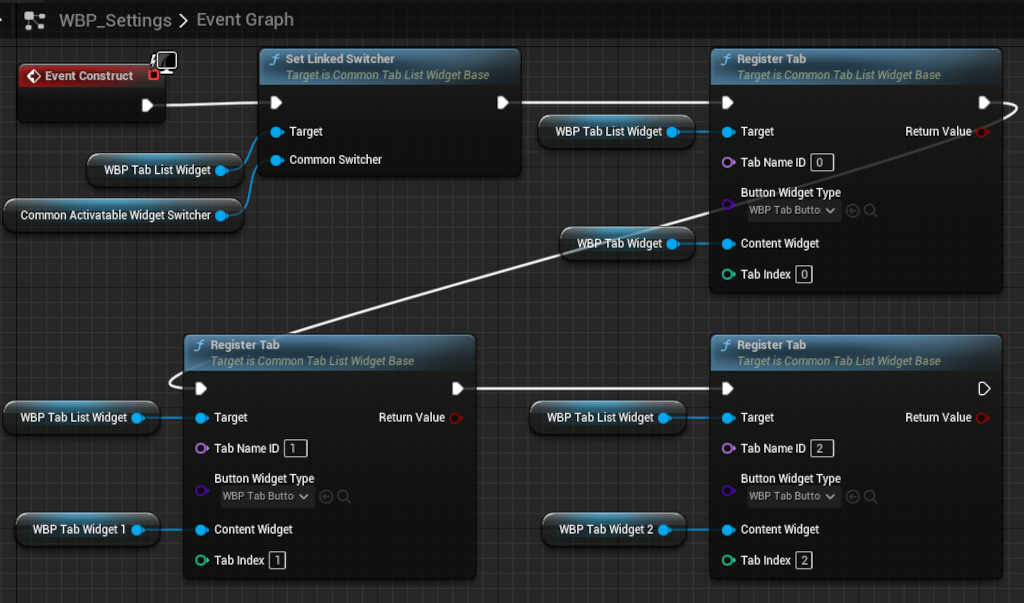
Now we link the tab widget with the widget switcher and register tabs to populate our tab list widget:
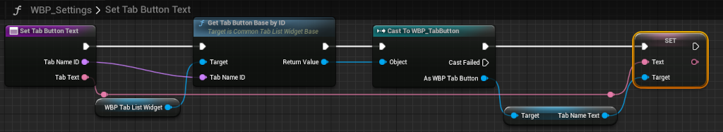
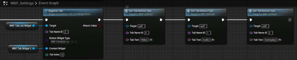
Then, to change the text on buttons we create a custom function and we set their texts based on TabNameId.
Finally, we need to bind CommonInputActionWidgets with their respective actions:
Now, the last thing we need to do is to implement the Settings Menu opening from the WBP_PauseMenu(Pic.33).
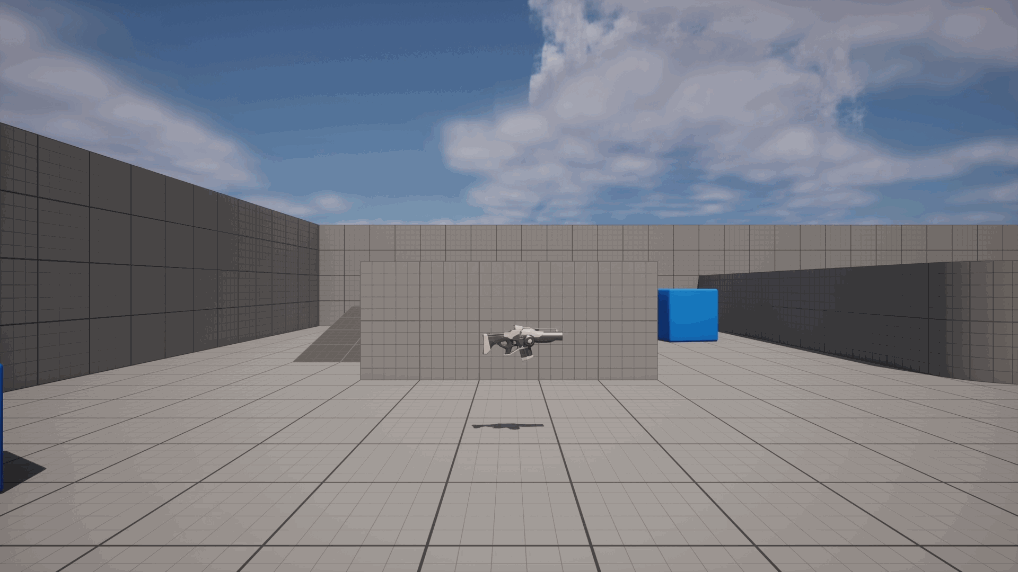
The final effect should look like this (tested on Xbox Series X):

Enjoys programming games since 2015.
4 years of commercial experience as an Unreal Engine developer.